Summary: Seaborn in Python enhances data visualization by providing a high-level interface built on Matplotlib. It integrates seamlessly with Pandas, offering diverse plot types like scatter, bar, heatmap, and regression plots. With built-in themes and statistical features, Seaborn simplifies exploring data patterns, relationships, and distributions for insightful analysis.
Introduction
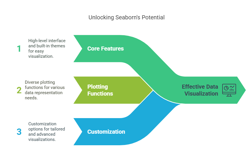
Data visualization is an essential skill for anyone working with data, and Python’s Seaborn library has become a go-to tool for creating insightful, beautiful, and informative statistical graphics.
In this comprehensive guide, we’ll explore everything you need to know about using Seaborn Python for data visualization, from its core features and plotting functions to customization and advanced use cases. Whether you’re a beginner or an experienced analyst, this guide will help you unlock the full potential of the Seaborn library in Python.
Key Takeaways
- Seaborn simplifies complex statistical visualizations with concise, high-level functions.
- It integrates tightly with Pandas for efficient data handling and plotting.
- Built-in themes and palettes enhance plot aesthetics and readability.
- Supports diverse plots like scatter, bar, heatmap, and regression plots.
- Automatic statistical estimation aids in insightful data exploration and analysis.
What is Seaborn Python?
Seaborn is a powerful Python data visualization library built on top of Matplotlib. It provides a high-level interface for drawing attractive and informative statistical graphics, making it easier to explore and understand your data visually. Seaborn is closely integrated with Pandas DataFrames, allowing seamless data manipulation and plotting.
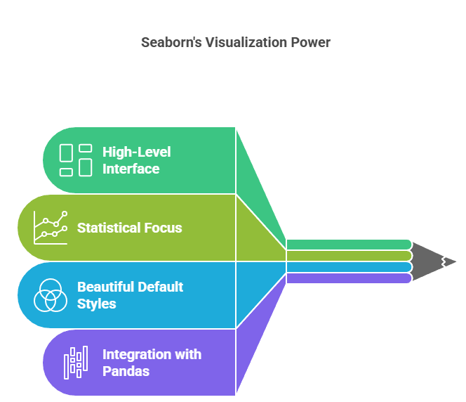
Why Use the Seaborn Library in Python?
- Simplifies complex visualizations: With concise syntax and high-level functions, Seaborn makes it easy to create a wide variety of plots.
- Statistical focus: Designed for visualizing statistical relationships and distributions, making it ideal for data analysis.
- Beautiful default styles: Seaborn comes with attractive themes and color palettes out of the box.
- Integration with Pandas: Directly works with DataFrames for efficient data handling.
- Customization: Offers extensive options to tweak and style plots for publication-quality visuals.
Getting Started with Seaborn
Installation
To install Seaborn, use pip:

You’ll also need Pandas, Matplotlib, and NumPy for most data visualization tasks.
Importing Seaborn

Core Features of Seaborn Library in Python
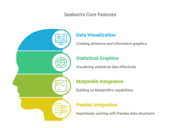
Seaborn is a powerful data visualization library in Python, designed to make statistical graphics both attractive and informative. Built on top of Matplotlib, it closely integrates with Pandas data structures, streamlining the process of visualizing complex datasets.
High-Level Interface
Seaborn offers concise, high-level functions to create a wide variety of statistical plots, often with a single line of code.
Built-in Themes and Aesthetics
It provides several built-in themes (like “darkgrid”, “whitegrid”, “dark”, “white”, and “ticks”) to enhance plot appearance and ensure consistency across visualizations.
Statistical Color Palettes
Seaborn includes numerous color palettes optimized for different data types, such as sequential, categorical, and diverging palettes, making it easy to effectively represent both categorical and quantitative variables.
Automatic Statistical Estimation
Many Seaborn functions automatically calculate and display statistical estimates (e.g., means, confidence intervals) directly on plots, reducing manual calculations.
Integration with Pandas
Seaborn works seamlessly with Pandas DataFrames, allowing users to reference columns by name and leverage Pandas’ data manipulation capabilities.
Flexible Plotting Functions
The library supports a wide range of plot types, including scatter plots, line plots, bar plots, box plots, violin plots, heatmaps, and more, each with extensive customization options.
Semantic Mapping
Seaborn allows users to map variables to visual elements (such as color, size, style), automatically adding informative legends and axis labels.
Essential Plot Types in Seaborn Python
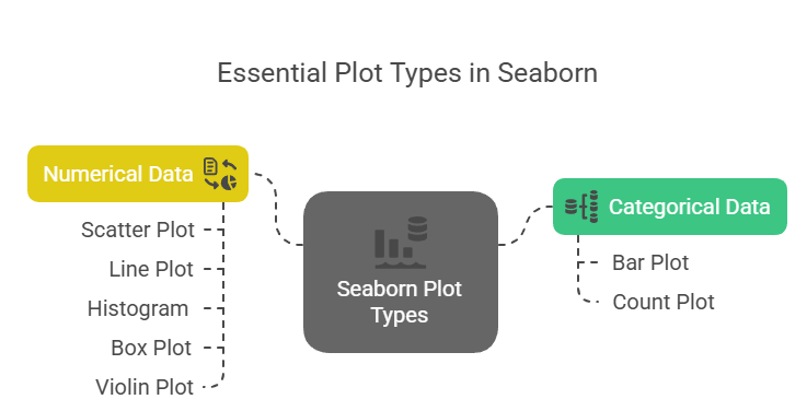
Seaborn offers a comprehensive suite of plot types for visualizing both categorical and numerical data, making it a powerful tool for exploratory data analysis and statistical visualization. Here are the essential plot types in the Seaborn library in Python:
Scatter Plot
A scatter plot visualizes the relationship between two numerical variables by plotting data points on an X and Y axis. It’s highly useful for identifying correlations, trends, or clusters in data. Created with sns.scatterplot(x, y, data).
Line Plot
Line plots show trends or changes over time or ordered categories by connecting data points with lines. They are ideal for visualizing time series data or continuous progression. Use sns.lineplot(x, y, data) for easy creation.
Bar Plot
Bar plots display aggregated values like means or sums for different categories, making it simple to compare quantities across groups. They are widely used to summarize categorical data. Generate them using sns.barplot(x, y, data).
Count Plot
Count plots visualize the frequency of each category within a categorical variable, showing how many times each category occurs. This helps quickly understand data distribution. Created with sns.countplot(x, data).
Histogram
Histograms depict the distribution of a continuous variable by dividing data into bins and showing the frequency within each bin. It reveals data spread, skewness, and modality. Use sns.histplot(x, data) to create histograms.
Box Plot
Box plots summarize data distributions by showing quartiles, medians, and potential outliers. They are excellent for comparing distributions across categories and spotting variability. Created with sns.boxplot(x, y, data).
Violin Plot
Violin plots combine box plot features with kernel density estimation to illustrate data distribution shape and density. They provide richer insights into data spread and modality than box plots alone. Use sns.violinplot(x, y, data).
Advanced Features of Seaborn Python

Seaborn is a versatile Python data visualization library built on Matplotlib, designed to simplify the creation of attractive and informative statistical graphics. Beyond basic plotting, Seaborn offers several advanced features that enhance its flexibility, customization, and analytical power.
FacetGrid and Multi-Plot Grids
Seaborn’s FacetGrid enables the creation of multiple plots arranged in a grid based on categorical variables. This is invaluable for comparing subsets of data side-by-side, such as visualizing distributions or relationships across different groups.
This feature allows you to explore complex datasets by breaking them down into smaller, comparable visual components.
Semantic Mapping and Automatic Legend Creation
Seaborn automatically maps variables to visual properties like color (hue), size, and style, creating meaningful legends and axis labels without extra coding. This semantic mapping simplifies multi-dimensional data visualization.
The library intelligently chooses color palettes and gradient scales based on data types, enhancing interpretability.
Statistical Estimation and Confidence Intervals
Many Seaborn functions, such as barplot() and pointplot(), automatically compute and display statistical estimates like means and confidence intervals. This built-in statistical functionality reduces the need for manual calculations and enriches plots with uncertainty information.
Users can customize the estimator function (e.g., mean, median, sum) and the confidence interval method, tailoring plots to specific analytical needs.
Integration with Pandas DataFrames
Seaborn works seamlessly with Pandas DataFrames, allowing direct use of column names for variables and effortless handling of complex data structures. This integration streamlines data preprocessing and visualization workflows.
Theming and Style Control
Seaborn offers multiple built-in themes (darkgrid, whitegrid, ticks, etc.) and color palettes to control the overall look and feel of plots. Users can set global styles or customize individual plots for consistency and aesthetic appeal.
Customization via Matplotlib Layer
While Seaborn provides high-level plot functions, it also allows users to access the underlying Matplotlib objects for fine-grained customization. This hybrid approach offers both ease of use and deep control.
Support for Wide and Long-Form Data
Seaborn accepts both wide-form and long-form datasets, providing flexibility in how data is structured and visualized. This adaptability makes it easier to work with diverse datasets without extensive reshaping.
Advanced Plot Types and Compositions
Seaborn supports complex plot types like violin plots, swarm plots, joint plots, and pair plots, which combine multiple visual elements to convey richer information about distributions and relationships.
Color Palette Customization
Users can select from numerous predefined palettes or create custom palettes to enhance visual storytelling and ensure accessibility.
These advanced features make Seaborn Python a powerful tool for creating insightful, publication-quality statistical graphics with minimal effort, while still offering extensive customization for expert users.
Conclusion
Seaborn Python is an indispensable tool for anyone working with data in Python, offering a powerful yet accessible way to create a wide variety of statistical visualizations. Its integration with Pandas, beautiful default styles, and high-level plotting functions make it ideal for both quick explorations and polished presentations.
By mastering the Seaborn library in Python, you can transform raw data into compelling visual stories, uncover hidden patterns, and communicate insights with clarity and impact.
Frequently Asked Questions
What Is Seaborn in Python Used For?
Seaborn is a Python data visualization library designed for creating attractive and informative statistical graphics. It simplifies complex plotting tasks, integrates with Pandas DataFrames, and is widely used for exploratory data analysis and statistical visualization.
How Is Seaborn Different from Matplotlib?
Seaborn is built on top of Matplotlib and provides a higher-level, more user-friendly interface. It offers better default styles, easier syntax for statistical plots, and seamless integration with Pandas, making it preferred for quick and attractive visualizations.
Can Seaborn Handle Large Datasets and Complex Visualizations?
Yes, Seaborn can handle large datasets efficiently, especially when combined with Pandas for data manipulation. It supports a wide range of plot types, customization options, and advanced features like FacetGrid for multi-plot grids, making it suitable for complex visualizations.
Authors
-

Written by:
Neha SinghReviewed by: