Summary: This guide teaches you how to create line chart in Excel, covering types of charts, advanced features, and best practices. Enhance your data visualization skills with clear instructions and expert advice.
Introduction
Creating a line chart in Excel is a straightforward process that allows you to visualize data trends over time or across categories. This document will guide you through the steps to create an Excel line chart, provide examples, and explain how to make a graph from a table, including how to incorporate two variables into your line graph.
Key Takeaways
- Select appropriate line chart types for Data Analysis.
- Use trendlines for forecasting future trends effectively.
- Customize charts with contrasting colors and clear labels.
- Avoid clutter by limiting data series displayed.
- Enhance readability with contextual information and annotations.
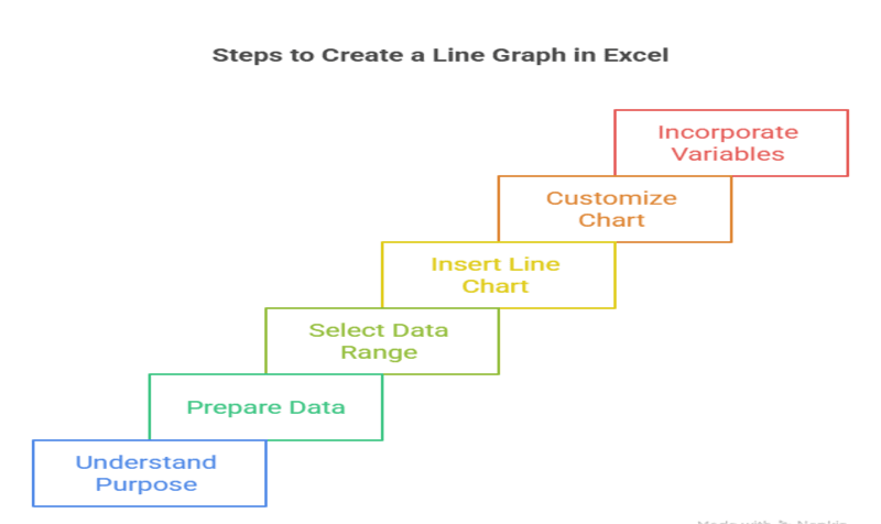
Steps to Create an Excel Line Chart
Learn the straightforward process of creating a line chart in Excel. This section guides you through selecting data, choosing chart types, and customizing your chart for effective data visualization. Follow these steps to transform your data into clear, actionable insights.
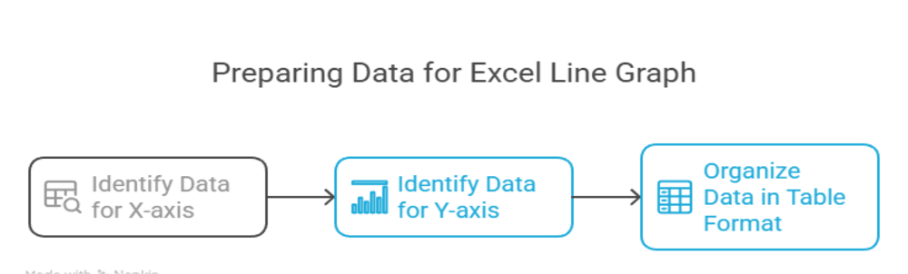
Prepare Your Data
Ensure your data is organized in a table format. Typically, you will have one column for the x-axis (e.g., time or categories) and one or more columns for the y-axis (e.g., values).
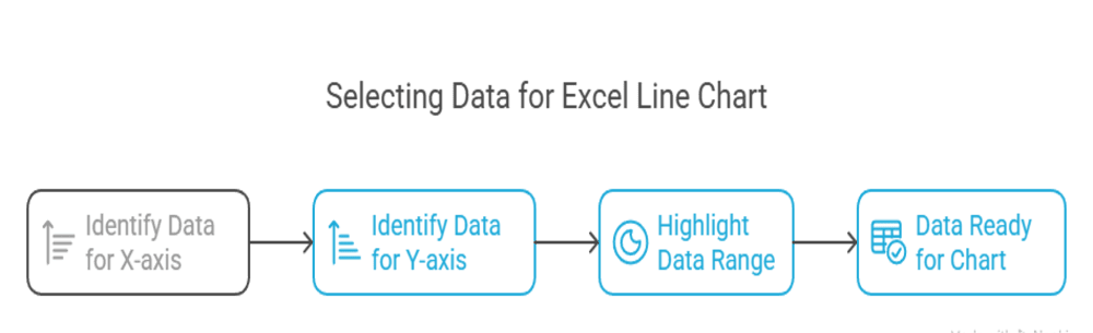
Select Your Data
Highlight the data you want to include in your line chart. This should include both the x-axis and y-axis data.
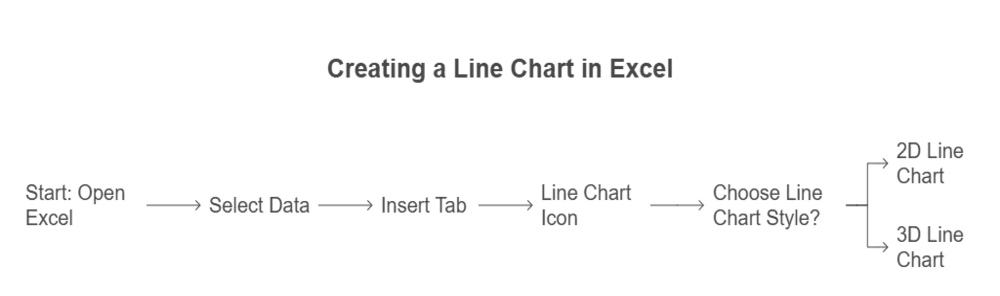
Insert Line Chart
- Go to the “Insert” tab in the Excel ribbon.
- Click on the “Line Chart” icon in the Charts group.
- Choose the specific line chart style you prefer (e.g., 2D Line, 3D Line).
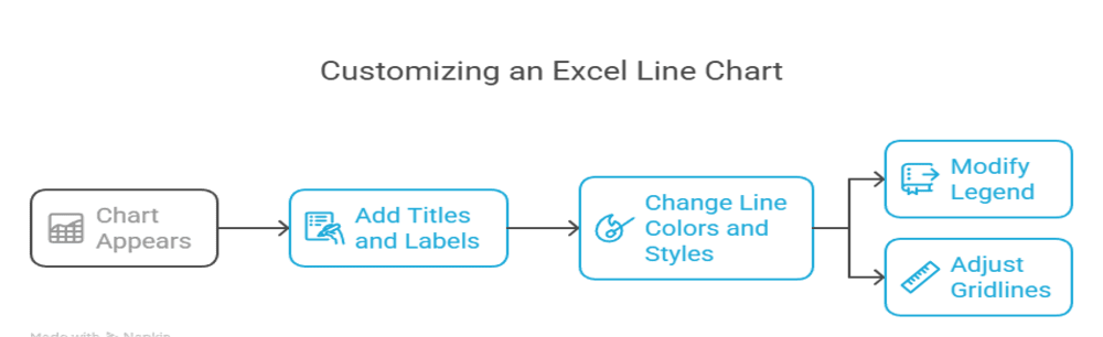
Customise Your Chart
Once the chart appears, you can customize it by:
- Adding chart titles and axis labels.
- Changing the line colors and styles.
- Modifying the legend and gridlines.
Save Your Work
After customizing your chart, make sure to save your Excel file to preserve your work.

Excel Line Chart Examples

Creating an Excel line chart can be enhanced by looking at various examples. For instance, you might have sales data over several months or temperature changes throughout the year. By visualizing this data, you can easily identify trends and patterns.
How to Make a Graph in Excel from a Table
Excel simplifies turning tables into charts for better data visualization. This section introduces the step-by-step process, including selecting data, inserting charts, and customizing them. Learn how to transform raw data into compelling visuals for presentations, reports, or analysis with ease.
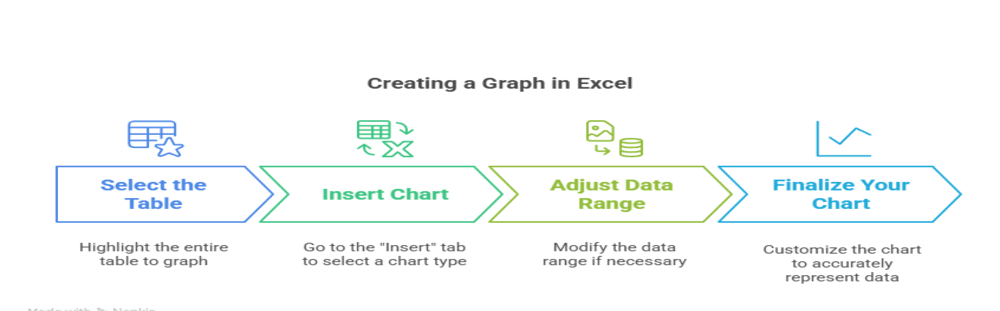
To make a chart in Excel from a table, follow these steps:
- Select the Table: Click and drag to highlight the entire table you want to graph.
- Insert Chart: As mentioned earlier, go to the “Insert” tab and select the type of chart you want to create.
- Adjust Data Range: If your table includes headers, Excel will automatically use them for your chart. You can adjust the data range if needed.
- Finalize Your Chart: Customize your chart as desired, ensuring it accurately represents the data from your table.
How to Make a Line Graph in Excel with 2 Variables
Creating a line chart with two variables in Excel allows you to compare trends effectively. This section provides step-by-step instructions, from selecting data sets to customizing the graph. Learn how to visualize relationships between two variables and present your insights clearly using Excel’s powerful charting tools.
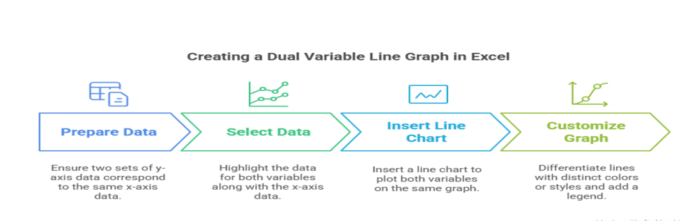
To create a line chart in Excel with two variables, follow these additional steps:
- Prepare Your Data: Ensure you have two sets of y-axis data corresponding to the same x-axis data.
- Select Data: Highlight the data for both variables along with the x-axis data.
- Insert Line Chart: Follow the same steps to insert a line chart. Excel will plot both variables on the same chart, allowing for easy comparison.
- Customize: Differentiate the two lines by using distinct colors or styles. Add a legend to clarify which line represents which variable.
By following these guidelines, you can effectively create and customize line graphs in Excel, making your Data Analysis more insightful and visually appealing.
Types of Line Charts in Excel
Line charts are a powerful tool in Excel for visualizing data trends over time or across categories. They help in identifying patterns, making comparisons, and analyzing changes in data. This document explores the various types of line charts available in Excel, their unique features, and when to use each type for effective data representation.
Basic Line Chart
The basic line chart is the simplest form of line chart, displaying data points connected by straight lines. It is ideal for showing trends over time, such as sales growth or temperature changes.
When to Use:
- To display a single data series over a continuous time period.
- When you want to highlight trends and changes in data.
Stacked Line Chart
A stacked line chart displays multiple data series stacked on top of each other. This type of chart is useful for showing the cumulative effect of multiple data series over time.
When to Use:
- To compare the contribution of different data series to a total over time.
- When you want to visualize how individual components contribute to a whole.
100% Stacked Line Chart
Similar to the stacked line chart, the 100% stacked line chart shows the percentage contribution of each data series to the total over time. Each data series is represented as a percentage of the total, making it easy to compare relative contributions.
When to Use:
- To emphasize the proportion of each data series relative to the total.
- When you want to show trends in percentage terms rather than absolute values.
Line with Markers Chart
This type of line chart includes markers at each data point, making it easier to identify individual values. It is particularly useful when you have a limited number of data points and want to highlight specific values.
When to Use:
- To emphasize individual data points along with the trend.
- When you want to make it easier for viewers to see specific values.
Smooth Line Chart
A smooth line chart uses curved lines instead of straight lines to connect data points. This type of chart is visually appealing and can make trends appear more fluid.
When to Use:
- To present data in a more aesthetically pleasing way.
- When you want to convey a sense of continuity in the data.
Line Chart with Multiple Axes
This type of line chart allows you to plot multiple data series with different scales on the same chart. It is useful when comparing data series that have different ranges or units.
When to Use:
- To compare data series with different units or scales.
- When you want to visualize relationships between different types of data.
Common Mistakes in Creating Line Charts

Creating effective line charts requires careful attention to detail. Here are some common mistakes to avoid
Cluttered Charts
Including too many lines can overwhelm viewers and obscure important trends. Limit the number of data series displayed to ensure clarity. Ideally, focus on two to three key series unless the context demands more.
Poor Axis Labels
Failing to label axes clearly can make the chart difficult to interpret. Ensure that both the X-axis and Y-axis have descriptive labels that explain what the data represents.
Ignoring Data Errors
Inaccurate or incomplete data can lead to misleading visuals. Always verify data for errors or missing values before creating a chart. Use Excel’s built-in tools like formulas or data validation to check for inconsistencies.
Inconsistent Scales
Using inconsistent scales on the Y-axis for multiple series can distort comparisons. Ensure that all series use the same scale unless there’s a compelling reason to do otherwise.
Insufficient Context
Failing to provide enough context can leave viewers confused about the chart’s purpose. Include relevant information such as data sources, time frames, or units of measurement.
Best Practices in Creating Line Charts
By adhering to best practices, you can create line charts that are not only visually appealing but also effectively communicate insights from your data.
Simplify Design
Use clean layouts with minimal distractions like unnecessary gridlines or excessive text. A clutter-free design helps focus attention on the data trends.
Use Contrasting Colors
Differentiate lines with distinct colors for clarity. Avoid using similar shades or colors that are hard to distinguish, especially for colorblind viewers. Consider using Excel’s built-in color palettes designed for accessibility.
Add Contextual Information
Include legends, titles, and annotations to provide context for the data. Legends help identify which line represents which data series, while titles and annotations can explain key points or trends.
Customize Axes
Adjust axis labels, scales, and gridlines to enhance readability. For example, use a date axis for time series data to ensure that the chart accurately reflects time intervals.
Conclusion
Line charts in Excel are versatile tools for analyzing trends and patterns in data. By understanding their types, leveraging advanced features, and adhering to best practices, you can transform raw data into compelling visuals that communicate insights effectively.
Frequently Asked Questions
How do I create a multi-line chart in Excel?
Highlight multiple columns of data, go to the “Insert” tab, select “Line Chart,” and choose your preferred style. Customize it further by adding legends or labels.
Can I add a trendline to my line chart?
Yes! Right-click on any line in your chart, select “Add Trendline,” then choose the type (linear, exponential) based on your analysis needs.
What is the difference between stacked line charts and 100% stacked line charts?
Stacked line charts show cumulative values over time; 100% stacked line charts display proportions as percentages for comparative analysis.
Authors
-

Written by:
Versha RawatReviewed by: