Summary: The Gini Coefficient is a widely used metric for measuring income inequality. It ranges from 0 (perfect equality) to 1 (extreme inequality). Governments and economists rely on it to develop policies that promote fair wealth distribution. Understanding its calculation, interpretation, and limitations helps assess economic disparity effectively.
Introduction
Imagine a country where everyone earns the same income, versus one where a single individual holds all the wealth. The Gini coefficient measures this disparity, quantifying income inequality on a scale from 0 (perfect equality) to 1 (absolute inequality).
This concept was developed by Corrado Gini, it’s widely used to assess economic disparities within and between nations. For instance, a Gini coefficient of 0.4 indicates moderate inequality, while a value of 0.8 suggests significant wealth concentration among a few individuals.
Understanding the Gini coefficient helps policymakers address economic disparities and promote more equitable societies.
In this blog, we will break down the Gini Coefficient, how it works, and what its values mean. You will also learn its advantages, limitations, and how it compares to other measures. By the end, you’ll clearly understand this important concept!
Key Takeaways
- It measures economic inequality from 0 (equal) to 1 (unequal).
- It is calculated using the Lorenz Curve or the Pairwise Income Gap Method.
- Governments use it to assess income distribution and design fairer policies.
- The Gini Coefficient has limitations but remains a widely used metric.
- Understanding data science concepts like the Gini Coefficient can provide valuable insights into economic analysis.
Defining the Gini Coefficient
It is a simple way to measure inequality in a group. It shows how evenly something—like income, wealth, or resources—is shared among people. The Gini Coefficient ranges from 0 to 1. A value of 0 means perfect equality, where everyone has an equal share. A value of 1 means perfect inequality, where one person owns everything, and the rest have nothing.
For example, imagine 10 people sharing ₹10,00,000:
- If each person gets ₹1,00,000, the Gini Coefficient is 0 (perfect equality).
- If a few people get much more while others get much less, the Gini Coefficient is around 0.5 (moderate inequality).
- If one person gets all ₹10,00,000 and the rest get nothing, the Gini Coefficient is 1 (extreme inequality).
Historical Background and Importance
Italian statistician Corrado Gini introduced this measure in 1912 to study inequality in income and wealth. Over time, experts started using it in other fields like healthcare, education, and biodiversity to measure disparities.
Governments, economists, and policymakers rely on the Gini Coefficient to understand inequality and create fairer policies. It helps design tax systems, social programs, and economic reforms to ensure better wealth distribution.
Calculation Methodology
It helps measure inequality by comparing income distribution to a perfectly equal distribution. There are two main ways to calculate it: one using the Lorenz Curve and the other using the Pairwise Income Gap Method. Let’s break them down in simple terms.
Using the Lorenz Curve to Calculate the Gini Coefficient
The Lorenz Curve is a graph that shows how income or wealth is distributed across a population. It plots the cumulative percentage of income (on the y-axis) against the cumulative percentage of the population (on the x-axis).
- A perfectly equal society would have a straight diagonal line, meaning everyone earns the same amount.
- A society with inequality will have a curved line, where a small percentage of people earn a large share of the total income.
It measures the gap between the Lorenz Curve and the line of perfect equality. The larger the gap, the higher the inequality.
The formula to calculate the Gini Coefficient is:
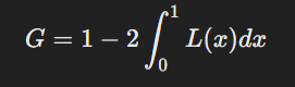
Where:
- L(x) is the Lorenz Curve function.
- The integral finds the area under the Lorenz Curve.
Example Calculation
Suppose we have a small society with five individuals earning ₹10,000, ₹20,000, ₹30,000, ₹40,000, and ₹50,000 per month.
- Arrange the incomes in ascending order.
- Calculate cumulative income shares and compare them to cumulative population percentages.
- Plot these points on the Lorenz Curve and compare them to the line of equality.
- Find the area between the Lorenz Curve and the Line of Equality, then apply the formula.
The calculated Gini Coefficient for this dataset is 0.27, indicating moderate inequality.
Using the Pairwise Income Gap Method
This method directly measures inequality by comparing income differences between all possible pairs in the dataset. The formula is:
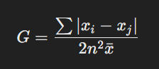
Where:
- xi and xj are individual incomes.
- n is the number of people.
- x̄ is the average income.
Example Calculation
For the same dataset (₹10,000, ₹20,000, ₹30,000, ₹40,000, ₹50,000):
- Find the absolute income differences between every pair (e.g., |10,000 – 20,000|, |10,000 – 30,000|, etc.).
- Add all these differences together (sum = ₹4,00,000).
- Divide by (2 × n² × mean income) for the final value.
This method also gives a Gini Coefficient of 0.27, confirming the level of inequality.
Both methods provide the same result, but the Lorenz Curve is more visual, while the Pairwise Method is valid for direct calculations.
Interpreting Gini Coefficient Values

The Gini Coefficient helps us understand how income is distributed within a country. It ranges from 0 to 1, or sometimes from 0 to 100 when expressed as a percentage. Lower values indicate more equality, while higher values signal greater income disparity.
Understanding the Scale: 0 to 1 (or 0% to 100%)
- A Gini coefficient of 0 (or 0%) means perfect equality—everyone has the same income. This is extremely rare in real-world economies.
- A Gini coefficient of 1 (or 100%) represents complete inequality, where one person has all the income, and everyone else has none.
- Most countries fall somewhere between values typically ranging from 0.25 to 0.65. Some sources multiply the values by 100 to present them as percentages.
What Do Low and High Gini Values Indicate?
- Low Gini Coefficient (< 0.30): More Equality
Countries with a lower Gini value have relatively even income distribution. This is often seen in nations with strong welfare policies, progressive taxation, free healthcare, and affordable education. Scandinavian countries, for example, have some of the lowest Gini values in the world due to their social programs. - Moderate Gini Coefficient (0.30 – 0.40): Balanced Distribution
Many developed nations fall into this range. While some income disparity exists, it is often offset by policies such as minimum wages, labor protections, and social security benefits. The United States, China, and Russia all have Gini values between 0.35 and 0.41, indicating moderate inequality. - High Gini Coefficient (> 0.40): Greater Inequality
A higher Gini value suggests significant income gaps. This is common in countries with weak labor laws, limited access to education, and wealth concentrated among a small group. South Africa, for example, has a Gini coefficient of around 0.63, making it one of the most unequal countries in the world.
Real-World Examples of Gini Coefficients
- Scandinavian Countries (Sweden, Norway, Denmark) – Gini < 0.30
These countries maintain low inequality through high taxes on the wealthy, strong labor protections, and universal social benefits. - United States, China, Russia – Gini between 0.35 and 0.41
While these nations have strong economies, income gaps persist due to factors like corporate wealth concentration, wage disparities, and tax policies favoring the wealthy. - South Africa – Gini ~ 0.63
South Africa has one of the highest income inequality rates globally, influenced by historical segregation, unequal access to education, and high unemployment rates.
Why Context Matters in Gini Interpretation
A country’s economic structure, government policies, and labor market conditions influence how we interpret its Gini coefficient. For example:
- A high Gini value in a developed nation may result from rising wage gaps in tech industries, tax breaks for the wealthy, or declining union power.
- A high Gini value in a developing country often signals limited access to education, informal labor markets, or land ownership concentration.
Government policies—such as progressive taxation, minimum wages, and welfare programs—can lower Gini values over time, making income distribution fairer.
Strengths of the Gini Coefficient
One of the biggest strengths of the Gini coefficient is its simplicity. It condenses complex income or wealth distribution data into a single number, making comparing inequality across different countries, regions, or periods easy. Policymakers, researchers, and economists often use the Gini coefficient because it provides a quick and precise snapshot of inequality levels.
Another advantage is its broad applicability. The Gini coefficient is most commonly used to measure income inequality. Still, it can also be applied to wealth distribution, consumption patterns, and access to resources like education or healthcare. This flexibility allows analysts to use it across different sectors to gain insights into social and economic disparities.
Weaknesses of the Gini Coefficient
Despite its usefulness, the Gini coefficient has limitations that must be considered. One major weakness is its sensitivity to data quality. In countries with informal economies or unrecorded income, inaccurate or incomplete data can lead to misleading Gini values.
For example, some organisations, like the World Bank, use consumption data as a substitute when income data is unreliable. However, this workaround isn’t perfect and may still overlook key aspects of economic inequality.
Another limitation is that the Gini coefficient focuses only on income or wealth inequality, ignoring other important factors like access to education, healthcare, or job opportunities. Societal inequality is complex, and a single number cannot capture all dimensions of economic disparity.
The Gini coefficient can sometimes produce the same value for different income distributions. For instance, two societies with vastly different economic structures may have identical Gini coefficients, masking significant variations in inequality. This is why it’s essential to interpret the Gini coefficient in context rather than relying on it as the sole measure of inequality.
Comparing the Gini Coefficient with Other Inequality Metrics
Measuring inequality is not limited to the Gini Coefficient. Several other tools provide different perspectives on income distribution. The U.S. government, for example, uses multiple inequality measures, which you can explore on the U.S. Census website. Below, we’ll look at key metrics and understand when the Gini Coefficient is the best choice.
Theil Index: Understanding Inequality Within and Between Groups
The Theil Index is helpful when comparing inequality across different groups, such as regions, industries, or demographics. It helps break inequality into two parts:
- Within-group inequality: Differences in income within a specific group (e.g., income gaps among workers in the same sector).
- Between-group inequality: Differences in income across groups (e.g., income gaps between rural and urban populations).
This makes the Theil Index an excellent choice for policymakers who want to identify areas where inequality is highest and create targeted solutions.
Atkinson Index: Focusing on the Poorest
Unlike the Gini Coefficient, which treats all income differences equally, the Atkinson Index focuses more on the lower-income population. It gives extra weight to changes in income at the bottom of the distribution. If the poorest people see an income increase, the Atkinson Index reflects that more significantly than the Gini Coefficient.
This makes the Atkinson Index helpful in evaluating policies to reduce poverty and improve the financial well-being of the most disadvantaged groups.
Lorenz Curve: A Visual Representation of Inequality
The Lorenz Curve, developed by Max Lorenz in 1905, provides a graphical way to understand income distribution. It shows the cumulative percentage of income earned by different population segments.
- A perfectly equal society: The curve is a straight diagonal line (meaning everyone has the same income).
- A highly unequal society: The curve bends further away from the diagonal, indicating that a small percentage of the population holds most of the wealth.
The Lorenz Curve is often used alongside the Gini Coefficient because it visually interprets inequality rather than a single number.
When Is the Gini Coefficient the Best Choice?
It remains the most popular measure of inequality because:
- It is simple to understand: A single number makes it easy to compare inequality between countries and over time.
- It works with different income levels: Unlike the Atkinson Index, which prioritises the poor, the Gini Coefficient considers the entire income distribution.
- It is widely used: Governments, researchers, and organisations worldwide use it, making it easy to find and compare data.
However, for deeper insights, combining the Gini Coefficient with the Theil Index, Atkinson Index, or Lorenz Curve can provide a more complete picture of inequality.
Bottom Line
The Gini Coefficient is a powerful yet simple tool for understanding income inequality. It helps economists, policymakers, and researchers assess economic disparity and design better policies for wealth distribution. While it has limitations, it remains a widely used measure of inequality.
To gain deeper insights into such vital data science concepts, consider learning data science for free with Pickl.AI. This course will equip you with essential analytical skills and hands-on experience to understand real-world data science applications, including inequality measurement.
Start your learning journey today and explore how data-driven insights shape economies and policies worldwide!
Frequently Asked Questions
What Does the Gini Coefficient Measure?
It measures income inequality within a population. A value of 0 represents perfect equality, while 1 indicates extreme inequality. It helps policymakers assess economic disparity and develop strategies for fair wealth distribution. This metric is widely used in economics, sociology, and policy-making.
How is the Gini Coefficient Calculated?
It is calculated using the Lorenz Curve or the Pairwise Income Gap Method. It compares actual income distribution with a perfectly equal scenario. The formula involves finding the area between the Lorenz Curve and the equality line or summing income differences in the Pairwise method.
Why is the Gini Coefficient Important?
The Gini Coefficient is crucial for understanding economic inequality. It helps governments and economists design policies like progressive taxation, minimum wages, and social programs. By tracking Gini values over time, countries can assess the impact of economic reforms and strive for a more balanced income distribution.
Authors
-

Written by:
Aashi VermaReviewed by: