
Summary: Prepare for your data visualization interview with our guide to the top questions and answers. Covering beginner to advanced topics, this resource helps you understand key concepts and showcase your expertise, increasing your chances of success.
Introduction
Data visualization is no longer just a niche skill; it’s a fundamental component of Data Analysis, business intelligence, and data science. The ability to transform raw numbers into compelling visual stories that drive insight and action is highly sought after.
If you are targeting roles involving data visualization, Data Analysis, or Business Intelligence, you can expect your interview to include questions specifically testing your data viz prowess.
Preparing for these questions is crucial. Interviewers aren’t just looking for textbook definitions; they want to understand your thought process, your design principles, your familiarity with tools, and your ability to communicate complex information effectively through visuals.
This blog post breaks down top data visualization interview questions into two categories: Beginner and Advanced. Whether you’re just starting or looking to step into a more senior role, these examples and expert answers will help you prepare and impress.
Key Takeaways
- Understand core data visualization principles and best practices.
- Learn how to choose appropriate charts for different data types.
- Practice explaining complex visualizations clearly and concisely.
- Prepare to discuss data storytelling and its importance.
- Be ready to address ethical considerations in data visualization.
Why Data Visualization Skills are Under the Microscope
Before diving into the questions, let’s quickly understand why companies care so much:
- Faster Insights: Visuals are processed much faster by the human brain than tables of numbers.
- Pattern Recognition: Well-designed charts reveal trends, outliers, and correlations that might be missed in raw data.
- Improved Communication: Visualizations provide a common language for discussing data across different teams and levels of technical expertise.
- Better Decision-Making: Clear insights derived from visualizations lead to more informed and data-driven decisions.
- Data Storytelling: Effective visualizations combined with narrative context turn data into compelling stories that persuade and inform.
Now, let’s get to the questions!
Part 1: Beginner Data Visualization Interview Questions
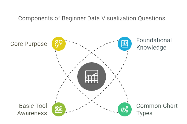
These questions typically focus on foundational knowledge, common chart types, basic tool awareness, and understanding the core purpose of data visualization.
Q1: What is data visualization, and why is it important in Data Analysis?
- What they’re testing: Your fundamental understanding of the concept and its value.
- Sample Answer:
“Data visualization is the graphical representation of information and data. By using visual elements like charts, graphs, and maps, data visualization tools provide an accessible way to see and understand trends, outliers, and patterns in data.
It’s crucial in Data Analysis because it transforms complex datasets, which can be difficult to grasp in raw form (like spreadsheets), into intuitive visuals. This makes it easier to identify relationships, spot emerging trends, communicate insights quickly, and ultimately support better, data-informed decision-making across an organization.”
Q2: Can you name some common chart types and explain when you would use each?
- What they’re testing: Your familiarity with basic chart types and their appropriate applications.
- Sample Answer:
“Certainly. Some common chart types include:
- Bar Chart: Excellent for comparing discrete categories or showing rankings. For example, comparing sales figures across different product categories. Vertical bars are standard, while horizontal bars work well with long category labels.
- Line Chart: Ideal for showing trends over time (time-series data). For instance, tracking website traffic month over month or stock price fluctuations.
- Pie Chart: Best used to show parts of a whole or percentage composition. However, they work best with only a few categories (ideally less than 5) as distinguishing slice sizes becomes difficult otherwise. A common example is showing market share distribution.
- Scatter Plot: Used to show the relationship or correlation between two numerical variables. For example, plotting advertising spend against sales revenue to see if there’s a connection.
- Histogram: Similar to a bar chart, but used to show the distribution of a single continuous numerical variable by dividing it into bins. For example, showing the distribution of student test scores.”
Q3: What data visualization tools or software are you familiar with?
- What they’re testing: Your awareness of the tool landscape and practical experience (even if basic).
- Sample Answer:
“I have hands-on experience using Microsoft Excel for creating basic charts and dashboards. I’ve also started learning and working with Tableau Public [or Power BI Desktop, Python libraries like Matplotlib/Seaborn, etc. – mention tools you actually know] to create more interactive and complex visualizations.
I understand the basic functionalities of [mention tool], such as connecting to data sources, dragging and dropping dimensions and measures, applying filters, and creating different chart types. I’m eager to deepen my skills in [mention a specific tool relevant to the job].”
Q4: What, in your opinion, makes a data visualization ‘effective’?
- What they’re testing: Your understanding of basic design principles and the goal of visualization.
- Sample Answer:
“An effective data visualization is one that clearly, accurately, and efficiently communicates the intended message or insight to its target audience. Key elements include:
- Clarity: It should be easy to understand at a glance. This involves choosing the right chart type, using clear labels, titles, and avoiding unnecessary clutter (like excessive gridlines or 3D effects).
- Accuracy: The visualization must faithfully represent the underlying data without distortion. Scaling axes appropriately is critical here.
- Relevance: It should directly address the question being asked or the insight being highlighted, tailored to the audience’s needs and understanding.
- Efficiency: It conveys the information quickly without requiring extensive effort from the viewer to interpret.”
Q5: Imagine you have a dataset with some missing values in a key column you need to visualize. How would you approach this?
- What they’re testing: Basic data preparation awareness as it relates to visualization.
- Sample Answer:
“First, I’d try to understand why the data is missing – is it random, or is there a pattern? The approach depends on the context and the amount of missing data.
- If only a small percentage is missing, I might consider excluding those records, especially if it doesn’t introduce bias.
- Alternatively, imputation techniques could be used, like replacing missing values with the mean, median, or mode of the column, although this should be done cautiously as it can affect the distribution.
- Sometimes, ‘missing’ itself is meaningful information, and I might visualize it as a separate category (e.g., ‘Unknown’).
The key is to document the approach taken and be aware of how handling missing data might impact the final visualization and interpretation.”
Part 2: Advanced Data Visualization Interview Questions
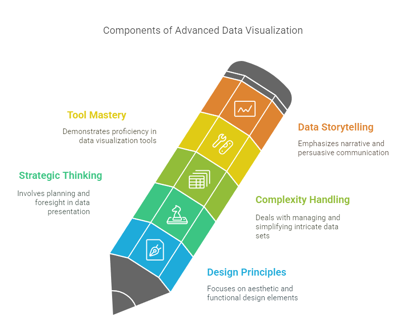
These questions probe deeper into design principles, strategic thinking, handling complexity, tool mastery, and data storytelling capabilities.
Q6: Can you explain the concept of ‘data storytelling’? How does it differ from just presenting a chart?
- What they’re testing: Your ability to think beyond individual charts and focus on narrative and insight delivery.
- Sample Answer:
“Data storytelling is the practice of building a narrative around a dataset and its visualizations to communicate insights and drive action. While presenting a chart shows what the data says, data storytelling explains the why and the so what. It involves weaving together three key elements:
- Data: The accurate foundation from which insights are drawn.
- Visualizations: The charts and graphs used to highlight key patterns and findings effectively.
- Narrative: The context, interpretation, and structure that guide the audience through the data, explain the insights, and often conclude with recommendations or calls to action.
It’s about creating a compelling journey for the audience, making the data memorable and persuasive, rather than just showing isolated facts.”
Q7: Describe your process for choosing the right visualization for a particular dataset and objective. What trade-offs do you consider?
- What they’re testing: Your critical thinking in chart selection, considering data types, goals, and audience.
- Sample Answer:
“My process starts with understanding the objective: What question are we trying to answer? What message do we need to convey? And who is the audience? Then, I consider the data itself:
- Data Types: Are we comparing categories (bar chart), showing trends over time (line chart), exploring relationships (scatter plot), understanding distribution (histogram), or showing parts of a whole (pie/treemap)?
- Number of Variables: Am I visualizing one, two, or multiple variables? This influences chart complexity (e.g., simple bar vs. stacked bar vs. scatter plot with size/color encoding).
- Audience: A technical audience might appreciate a complex box plot, while an executive audience might prefer a simpler summary chart.
- Trade-offs: There are always trade-offs. A pie chart is simple for parts-of-a-whole but poor for precise comparisons (a bar chart is better). A scatter plot shows relationships but can become cluttered with too much data (requiring aggregation or sampling).
A map is great for geographic data but useless if location isn’t relevant. The key is choosing the chart that conveys the intended insight most clearly and accurately for the specific context, even if it means sacrificing some detail.”
Q8: Walk me through your typical workflow when designing an interactive dashboard.
- What they’re testing: Your structured approach to dashboard design, focusing on user needs and interactivity.
- Sample Answer:
“My dashboard design workflow typically involves these steps:
- Define Purpose & Audience: Clearly identify the key questions the dashboard should answer and who will be using it. What are their primary needs and technical levels?
- Identify Key Metrics (KPIs): Determine the most critical metrics that need to be tracked to meet the dashboard’s purpose.
- Sketch & Wireframe: Create low-fidelity mockups to plan the layout, placement of charts, filters, and overall flow. Focus on hierarchy – most important info top-left.
- Data Preparation: Ensure the underlying data is clean, structured appropriately, and readily available for the chosen tool.
- Build Visualizations: Select the most effective chart types for each metric or insight, adhering to best practices for clarity and accuracy.
- Implement Interactivity: Add meaningful interactions like filters (e.g., by date, region), highlighting, drill-downs, or tooltips that allow users to explore the data further without overwhelming them.
- Testing & Iteration: Get feedback from potential users. Test performance, usability, and clarity. Refine the design based on feedback.
- Deployment & Documentation: Deploy the final dashboard and provide necessary documentation or training.”
Q9: How do you ensure your data visualizations are accessible to all users, including those with disabilities like color blindness?
- What they’re testing: Your awareness of accessibility best practices (a crucial aspect of responsible design).
- Sample Answer:
“Accessibility is critical for ensuring everyone can understand the information. Key practices include:
- Color Choice: Avoid relying solely on color to convey information, especially red/green combinations which are problematic for common types of color blindness. Use color palettes that are perceptually distinct and colorblind-safe. Tools exist to simulate color blindness views.
- Use Multiple Cues: Combine color with other visual cues like labels, patterns, shapes, or icons to differentiate data series.
- Text & Contrast: Ensure sufficient contrast between text (labels, titles) and the background. Use readable font sizes.
- Provide Alternatives: Offer data tables alongside complex charts. Include clear titles, captions, and alt-text for screen readers where applicable.
- Simplicity: Keep designs clean and avoid unnecessary visual clutter that can hinder interpretation for everyone, especially those with cognitive impairments.”
Q10: How would you approach visualizing a very large dataset (e.g., millions or billions of rows)? What are the performance considerations?
- What they’re testing: Your understanding of scalability challenges and techniques for handling big data visualization.
- Sample Answer:
“Visualizing massive datasets directly in tools like standard Tableau or Power BI can be challenging due to performance limitations. Key strategies include:
- Aggregation: Instead of plotting every single point, visualize aggregated data (e.g., daily/weekly sums or averages instead of per-second readings). This is often sufficient for identifying trends.
- Sampling: Visualize a representative random sample of the data if the goal is to understand distribution or relationships without needing every single point.
- Server-Side Rendering/Live Connection: Utilize tools and database features that perform calculations and rendering on the server side, sending only the necessary visual information to the client (e.g., Tableau with live connections to optimized databases, Power BI DirectQuery).
- Specialized Tools: For extremely large datasets, specialized tools or platforms designed for big data visualization might be necessary.
- Pre-computation: Pre-calculate summaries or aggregates in the data preparation stage.
Performance considerations are paramount: load times, interaction responsiveness (filtering, drill-down speed), and memory usage. The goal is to provide insights without forcing the user to wait excessively or crashing the tool.”
Conclusion: Practice Makes Perfect
Mastering data visualization is a journey that combines technical skills, design principles, and effective communication. Preparing for data visualization interview questions by understanding the concepts behind them and practicing your answers will significantly boost your confidence.
Remember to always relate your answers back to real-world application and how visualization ultimately drives better understanding and decisions. Good luck!
Authors
-

Written by:
Neha SinghReviewed by:


