
Summary: This article covers essential data visualisation using matplotlib techniques, including scatter plots, bar charts, histograms, pie charts, box plots, and heatmaps. Each method explained in terms of its purpose and application, helping you choose the right visualisation for your data analysis needs.
Introduction
Data visualisation is a powerful tool that helps us understand, interpret, and communicate data effectively. It transforms raw data into meaningful visuals, making complex information easier to grasp.
Python, with its rich ecosystem of libraries, offers a versatile platform for data visualisation. Among these libraries, Matplotlib stands out as a cornerstone for creating a wide range of static, animated, and interactive plots.
What is Matplotlib?
Matplotlib is a Python library used for creating static, animated, and interactive visualisations. It provides a high-level interface for plotting different types of data, including line plots, scatter plots, histograms, bar charts, and more. Data Visualisation using Matplotlib is highly customizable, allowing you to tailor your plots to your specific needs.
Getting Started with Matplotlib
To begin using Matplotlib, you’ll need to install it. If you’re using Anaconda, it’s likely already installed. Otherwise,

Once installed, you can import the library into your Python script:

Basic Plotting with Matplotlib
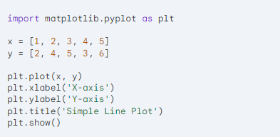
Let’s start by creating a simple line plot.This code will generate a basic line plot with the x-axis labelled as “X-axis” and the y-axis labelled as “Y-axis”. The title of the plot is “Simple Line Plot”.
Different Plot Types
Understanding different plot types is essential for effective data visualisation. Each type serves a specific purpose, helping to convey insights clearly and accurately. From scatter plots that reveal relationships between variables to bar charts that compare categories, selecting the right plot type enhances data interpretation and communication in analysis.
Scatter Plots
Scatter plots visualise the relationship between two continuous variables by displaying data points on a Cartesian plane. Each point represents an observation, allowing for the identification of patterns, trends, or correlations, such as positive, negative, or no correlation between the variables.

Bar Charts
Bar charts are graphical representations use to compare values across different categories. Each category represented by a rectangular bar, with the length or height corresponding to the value it represents. This format makes it easy to see differences and trends among categories at a glance.

Histograms
Histograms visualise the distribution of a single continuous variable by dividing the data into bins or intervals. Each bar represents the frequency of data points within a specific range, allowing for an understanding of the underlying distribution, including skewness, modality, and the presence of outliers.

Pie Charts
Pie charts represent proportions of a whole by dividing a circle into slices. Each slice corresponds to a category’s contribution to the total, making it easy to visualise relative sizes. However, they are best used for a limited number of categories to avoid clutter.

Box Plots
Box plots visualise the distribution of data through their quartiles, highlighting the median, interquartile range, and potential outliers. This graphical representation provides insights into data spread and symmetry, making it easier to compare distributions across different groups or categories.

Heatmaps
Heatmaps visualise two-dimensional data using colour gradients to represent values in a matrix format. Each cell’s colour corresponds to a specific value, allowing for quick identification of patterns, correlations, or anomalies across variables, making them particularly useful in data analysis and exploration.
Customising Plots
Matplotlib offers extensive customization options to tailor your plots to your specific requirements. You can modify the appearance of lines, markers, colours, labels, and more. For example:

This code will plot a red line with circles as markers and a dashed line style.
Subplots
You can create multiple plots within a single figure using subplots:

Saving Plots
To save a plot as an image, use the plt.savefig() function:

Conclusion
Matplotlib is a comprehensive library that offers a wide array of advanced features for data visualisation. By mastering these techniques, you can create informative and visually appealing plots that effectively communicate your data insights. Whether you’re working with simple line charts or complex 3D visualisations, Matplotlib provides the tools needed to elevate your data presentation.
For further exploration, consider integrating Matplotlib with libraries like Seaborn for statistical graphics or Plotly for interactive visualisations, enhancing your data storytelling capabilities.
Frequently Asked Questions
What is Matplotlib used for?
Matplotlib is a Python library used for creating static, animated, and interactive visualizations. It allows users to generate a wide variety of plots, such as line graphs, bar charts, scatter plots, and histograms, making it essential for data analysis and presentation in various fields.
How can I Customise plots in Matplotlib?
You can customise plots in Matplotlib by modifying elements like colors, line styles, markers, titles, and labels. Use functions such as set_title(), set_xlabel(), and set_ylabel() for titles and labels, and adjust properties like color, linestyle, and linewidth directly in the plotting functions.
Can I Create 3D Plots with Matplotlib?
Yes, Matplotlib supports 3D plotting through the mpl_toolkits.mplot3d module. You can create 3D scatter plots, surface plots, and more by adding a 3D subplot and using functions like scatter() and plot_surface(), allowing for effective visualization of multidimensional data.
Authors
-

Written by:
Aashi VermaReviewed by:


