
Summary: Bokeh is an open-source Python library designed for creating interactive visualisations for modern web browsers. It enables users to generate complex plots easily and embed them into web applications. With features like real-time streaming, customizable dashboards, and extensive support for various data formats, Bokeh empowers data scientists and developers to present data effectively.
Introduction
In the era of big data, effective data visualisation is crucial for understanding complex datasets and making informed decisions. Bokeh, a powerful Python library, stands out for its ability to create interactive plots and dashboards that can be easily embedded in web applications.
This blog will explore Bokeh in detail, covering its features, setup, basic and advanced plotting techniques, real-world applications, and best practices.
What is Bokeh?
Bokeh, an open-source Python library, enables users to create interactive and visually appealing plots. Unlike static plotting libraries such as Matplotlib, it renders its visualisations using HTML and JavaScript, making it particularly suited for web applications.
This interactivity allows users to engage with the data more dynamically, facilitating deeper insights and exploration.
Key Features of Bokeh
- Interactivity: It plots are interactive by default, allowing users to zoom, pan, and hover over data points for additional information.
- Flexibility: The library supports a wide range of plot types, from simple line graphs to complex multi-layered visualisations.
- Integration: It easily integrates with other popular Python libraries, such as Pandas and NumPy, making it a valuable tool for Data Analysis.
- Web-Friendly: Bokeh generates HTML and JavaScript outputs, allowing you to embed visualisations directly into web applications or share them online.
- Customisability: Users can customise plots extensively, adjusting colours, sizes, and labels to suit their specific needs.
Setting Up Bokeh
Before diving into creating visualisations, it’s essential to set up Bokeh in your Python environment. Here’s how to get started:
Step 1: Installation
You can install Bokeh using pip or conda. Open your terminal or command prompt and run:
Or, if you are using Anaconda, execute:
Step 2: Verifying Installation
To confirm that Bokeh is installed correctly, you can start a Python session and import the library:
If no errors occur and the version number is displayed, you are ready to create interactive visualisations.
Step 3: Creating Basic Plots with Bokeh
Bokeh simplifies the process of creating plots with its intuitive API. Here’s a step-by-step guide to creating a basic line plot.
Example: Creating a Simple Line Plot
Import Required Libraries
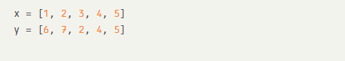
Prepare Data
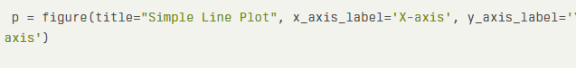
Create a Figure
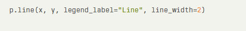
Add a Line Glyph
Display the Plot
This code snippet creates a simple line plot with labelled axes and a title.
Creating Other Basic Plots
Bokeh supports various plot types, including bar charts, scatter plots, and histograms. Here’s a brief overview of how to create a bar chart:
Example: Creating a Bar Chart
Prepare Data
Create a Figure
Add a Bar Glyph
Display the Plot
Advanced Plotting with Bokeh
Once you are comfortable with basic plots, it offers advanced features to create more complex visualisations.
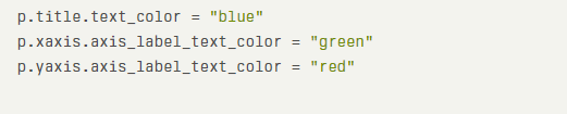
Customising Plots
Bokeh allows extensive customization of plots. You can modify colours, add legends, and change axis properties. Here’s how to customise a plot:
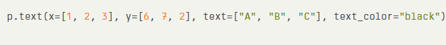
Adding Annotations
Annotations can provide additional context to your plots. You can add text labels or arrows to highlight specific data points.
Example: Adding Annotations
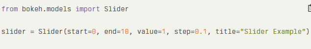
Creating Interactive Widgets
Bokeh supports interactive widgets, allowing users to manipulate the data displayed in real-time. You can use sliders, dropdowns, and buttons to enhance user engagement.
Example: Using a Slider
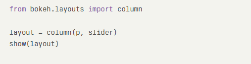
Layouts and Grids
Bokeh allows you to arrange multiple plots and widgets in a grid layout, making it easy to create dashboards.
Example: Creating a Grid Layout
Real-World Application Example
Bokeh is widely used in various industries for data visualisation. One notable application is in the field of finance, where analysts use Bokeh to create interactive dashboards that display real-time stock market data.
Example: Financial Dashboard
In a financial dashboard, it can be used to visualise stock prices, trading volumes, and market trends. Users can interact with the dashboard to filter data by date ranges, compare multiple stocks, and view historical performance.
Implementation Steps
- Data Acquisition: Use APIs to fetch real-time stock data.
- Data Processing: Clean and preprocess the data using Pandas.
- Visualisation: Create interactive plots using Bokeh to display stock prices and trading volumes.
- Deployment: Embed the dashboard in a web application for users to access.
Tips and Best Practices
Explore essential tips and best practices for using Bokeh effectively. From optimising performance to enhancing visual aesthetics, these guidelines will help you create stunning, interactive visualisations that engage your audience and convey your data’s story clearly.
To make the most of Bokeh, consider the following tips and best practices:
- Choose the Right Plot Type: Select the plot type that best represents your data. Consider factors like data distribution, relationships between variables, and the desired level of detail.
- Use Appropriate Colour Schemes: Choose colour schemes that are visually appealing, easy to distinguish, and accessible to people with colour vision deficiencies.
- Label Axes and Add Titles: Clear and concise labels and titles make your plots easier to understand.
- Optimise for Performance: For large datasets or complex visualisations, consider techniques like downsampling, aggregation, or using Bokeh’s tools for performance optimization.
- Leverage Bokeh’s Interactivity: Utilise Bokeh’s interactive features, such as zooming, panning, and tooltips, to provide a richer user experience.
- Consider Accessibility: Ensure your visualisations are accessible to people with disabilities by following accessibility guidelines and using appropriate colour contrasts.
- Use Bokeh’s Built-in Widgets: Take advantage of Bokeh’s widgets (e.g., sliders, buttons, dropdowns) to allow users to interact with and customise your visualisations.
- Test and Iterate: Create prototypes, test your visualisations with different datasets and user groups, and iterate to refine the design and functionality.
Conclusion
Bokeh is a powerful tool for creating interactive and visually appealing data visualisations in Python. Its flexibility, ease of use, and ability to integrate with web applications make it an excellent choice for Data Analysts and developers alike.
By mastering it, you can transform complex datasets into insightful visual narratives that engage and inform your audience.
Frequently Asked Questions
What is Bokeh Used For?
It is used for creating interactive data visualisations in Python. It is particularly suited for web applications, allowing users to explore data dynamically through various plot types, including line graphs, bar charts, and scatter plots.
How do I Install Bokeh?
You can install it using pip by running pip install bokeh in your terminal. Alternatively, if you use Anaconda, you can install it with conda install bokeh. Verify the installation by importing Bokeh in Python.
Can I Create Dashboards with Bokeh?
Yes, Bokeh allows you to create interactive dashboards by combining multiple plots and widgets. You can arrange these elements using layouts and grids, making it easy to present complex data in an accessible format for users.
Authors
-

Written by:
Aashi VermaReviewed by:


