Summary: This tutorial guides you through creating a Waterfall Chart in Excel, from data preparation to chart customisation. Learn to insert the chart, adjust colours, and set end values for effective data visualisation.
Introduction
If you want complete step-by-step guidance on creating a Waterfall Chart in Excel or modifying and inserting a meaningful waterfall chart in Excel, your search ends here.
Those who frequently use Excel are probably already familiar with the advantages of charts. When you want to compare your data or quickly identify a trend, a graphical depiction of your data is helpful.
Microsoft Excel has many predefined chart types, such as column, line, pie, bar, radar, etc. This article will explore more than simple chart creation and examine a unique sort of Excel chart called a waterfall chart.
We’ll explain waterfall charts and show you how helpful they can be. You will learn how to create one in Excel and about the resources that can speed up the process.
Must Read: Stacked waterfall chart in Excel – Step by Step Tutorial.
What is a Waterfall Chart?
First, look at an easy-to-understand waterfall chart’s appearance and possible usages.
A waterfall chart is a particular type of Excel column chart. It usually demonstrates how a starting position changes, increasing or decreasing over time.

The first and last columns in a conventional waterfall chart show total values. The ultimate total value is reached by adding the intermediate columns, which appear to float and show positive or negative fluctuations over time.
These columns typically use colour coding to distinguish between positive and negative numbers. A little later in this tutorial, you’ll learn how to make the intermediate columns float.
Since the floating columns connect the ends, a waterfall chart is also called an Excel bridge chart. These graphs are helpful when conducting an analysis. A waterfall chart in
Excel is precisely what you need if you need to assess a company’s profit or product earnings, make an inventory or sales study, or simply display how the number of your Facebook friends changed over the year.
Read Blogs:
Master VBA in Excel: Essential Tips and Tricks for Beginners.
Conquering Concatenation: Mastering Text Combining in Excel.
How do you insert a Waterfall Chart in Excel?
One of the most crucial elements in acquiring insights and understanding the information in the data for further analysis is how we look at or engage with it.
We can better extract information from the columns in Excel by building a relationship between the user and the columns by designing a visually appealing waterfall chart with strategic colour selections and measurements. Here, we’ll go over step-by-step instructions for making a waterfall chart in Microsoft Excel.
Data Preparation and Loading the Data
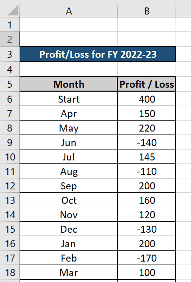
The first step in constructing a waterfall diagram is to ensure that you have some data to build the visualisation. After you get the desired data, you must format the data in initial value, last value, intermediate positive value, and negative value. You can identify the data by categorising it and marking it accordingly.
Let’s create two new columns in Excel and name them Month and Profit/Loss. Then, we fill the rows with information to construct the waterfall chart in Excel. In this case, positive values indicate a profit, whereas negative ones indicate a loss.
Check Out: Master Excel’s HLOOKUP: The Ultimate Guide to Finding Data Faster.
Creating the Waterfall Chart in Excel
After the data has been added, the waterfall chart is created in an Excel file. The graph displays changes in values over time, volatility, and revenue ups and downs. Pressing Ctrl + Shift + Arrow down or manually choosing rows with the mouse will select all the rows.
Now go to the INSERT tab and click on the CHARTS option shown below in red marking.

Select the 1st option, “Waterfall”, from the dropdown menu, and the waterfall chart will appear in your Excel, displaying the month-wise Profit/Loss values in the Waterfall Chart.

Adding the End / Closing Bar to the Chart
Add a row at the end of your base data and name it as End or Closing value. After this, take the sum of all the values above by using the formula { =SUM(B6:B18) }
Click anywhere on the Waterfall Chart to find that the base data is selected with coloured lines. Click on the bottom corner of the coloured line and drag it to the end of the base data, including the End column within the selected data.

Discover: How to Use Count In Excel: A Guide to The COUNT Function.
Modifying the Waterfall Chart
If you compare the Waterfall Chart above with the chart at the beginning of this tutorial, you will find that the End column is different.
In the above chart, the End column does not present the true insight that we are trying to portray because, unlike the other columns, it does not just represent a value for any period; rather, it means the aggregate or total value for all months’ profit or loss amounts.
The base data suggests that the opening or start value for FY 2022-22 was 400. We added or deducted some profits or losses from the start value every month. Then, at the end of FY 2022-23, we will have 1145 as the End or closing revenue. So, the Waterfall Chart should also treat the End value as a total value.

To Modify the End value to the total value, double-click on the bar showing 1145. Once you double-click on this bar, the Format Data Series panel will open on your right side, as shown below.
If you once again single-click on the End bar, all other bars will fade, and only the End bar will be highlighted. Now notice that on the Format Data point panel, you can see an extra checkbox option called “Set as total.”
Select this checkbox to see the transformation of the End bar. The end bar’s colour will be changed to distinguish it as a total value.

More For You to Read:
MIS Report in Excel? Definition, Types & How to Create.
Data Validation in MS Excel: A Guide.
Modifying Colours of Bars
Now, if you want to modify the colours of these bars into 3 different colours – Blue for the Start and End bars, Green for representing Profit bars, and Red for identifying Loss bars then do the following:
- Double-click on the Start bar and then again single-click on the Start bar so that only the Start bar is highlighted and the other bars are faded. Now, as shown in the picture below, click on the Change Colors dropdown and select the blue colour.
- Repeat the same process for each bar and select Green for the profit bars and red for the Loss bars.

- Click on the Chart Title and give a suitable name for the chart’s purpose.
- Click on the “+” button on the top right side of the chart and select the Axis Title (shown in Red underline)
- Provide suitable Axis names that represent the value of the X and Y axis
- You can see different predefined waterfall chart templates in the Design tab in the Chart Style section.
- Choose any of the predefined formats as per your choice.
- I have chosen the grey format (shown in red underlined), and the final Waterfall Chart is shown below.

Further See:
How to Become a Certified Microsoft Excel Expert?
Essential Keyboard Shortcuts in MS Excel.
Frequently Asked Questions
What is a Waterfall Chart in Excel?
A Waterfall Chart in Excel visually represents how an initial value changes over time, showing incremental gains and losses. It highlights how starting values are impacted by various factors, making it ideal for financial analysis, inventory tracking, or any scenario where understanding cumulative changes is crucial.
How do I create a Waterfall Chart in Excel?
To create a Waterfall Chart in Excel, prepare and format your data with initial values, gains, and losses. Select your data, go to the “Insert” tab, click “Waterfall” under the “Charts” option, and customise it. Adjust colours, add end bars, and fine-tune for clarity.
Can I modify the colours of the bars in a Waterfall Chart?
Yes, you can customise bar colours in a Waterfall Chart by selecting the bar you want to change and choosing “Change Colors.” Assign distinct colours for different bars, such as blue for start/end, green for profits, and red for losses, to enhance visual distinction and clarity.
Conclusion
Creating a Waterfall Chart in Excel enhances data visualisation by showing how values fluctuate over time. This step-by-step guide simplifies inserting and customising the chart, making it easier to analyse financial data or track changes. With clear instructions, you can effectively present your data.
Authors
-

Written by:
Biswadip BanerjeeReviewed by: